Importance of Logo Branding
Logo is a graphical mark used to identify a company, an organization, product or brand. Logos are displayed alongside of a company’s name in order to generate awareness of the company’s association with a particular product or service. It is presented with graphical lettering, or an abstract shape of design.
The current era of logo design dates back in the 1870s; with the first abstract logo of Bass Brewery – the biggest beer company then. Its logo red triangle began the branding campaign in history. Its brand name and the iconic “red triangle” logo were registered as a trademark under the British Trade Mark Registration Act 1875 on 1 January 1876, just when the act was freshly implemented. After successfully becoming the first registered trademark in England, Bass Ale was filed as trademark no.1. It seemed practical for Bass Ale to use a shape as basic as a lozenge triangle; the triangle symbolizes rising energy, prosperity and the wealth of life. The use of red color, on the other hand, also signifies energy, as well as passion, vitality and enthusiasm for life. The brand name is handwritten to underline the elegant and authentic expression.
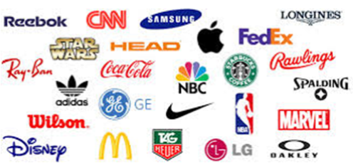
Today there are countless corporations, products, brands, services, agencies and other entities using an ideogram (sign, icon) or an emblem (symbol) or a combination of sign and emblem as a logo. But, out of countless logos only few are recognized without name. An effective logo may consist of both an ideogram and the company name (logotype) to emphasize the name over the graphic, and employ a unique design via the use of letters, colors, and additional graphic elements.
A good logo is instantly recognized; it should be inimitable, and exclusive to be remembered by people. Usually people recall a name, a design, a shape if they see it twice, whereas their eyes could pass right over written matter. So people don’t register written statements compared to a shape or design. The more often a potential customer sees and associates a reference to a company the more familiar he/she will begin to feel to the company. And their association with the logo makes their buying process easier.
Logos are an example of intangible assets because they hold value, but not in a physical form. They have become an essential part of a company’s identity, and are used heavily in the marketing of products and services. A well-recognized logo can increase a company’s goodwill, and is trademarked for intellectual property protection.
The three ellipses seen in the logo for Toyota represent three hearts: the heart of the customer, the heart of the product, and the heart of progress in the field of technology.
So why should organizations invest in a logo? Maybe the organization is considering branding or re-branding. Perhaps it has grown very big and needs fighting out competition or it plans to diversify business, whatever the reason, designing a evocative logo is the starting point of the exercise. The logo intensifies the branding efforts. Building a solid, well-designed logo is pivotal to the success of a business, its life and its marketing and sales activity.
Not only does a logo set apart a business from others, it appears on its stationary, website, advertisements, business cards of its executives, packaging, hoardings, name board – it becomes an inevitable part of the corporate communication. The company’s logo design influences the design of its entire existence and business process. It represents the philosophy of the company therefore designing a ‘brandable’ logo is a must.
See how the letter “M” for McDonald’s stands out. There really isn’t much meaning attached to this logo. In the 60′s, McDonald’s wanted to change the logo but their design consultant and psychologist Louis Cheskin insisted that they continue with the golden arches made in “M” Louis told them that the customers will unconsciously recognize the logo as “symbolism of a pair of nourishing breasts.” Whether this is true or not, their logo is one of the most recognizable in the world.
Historically, pictures were used to convey messages to individuals who were unable to read. A picture of a loaf of bread would be used on a signage to denote a baker. Even if the word “bread” was not displayed, consumers knew the type of product available at that store.
A powerful logo is one of the most valuable assets a company can utilize to broaden its base and maximize its recognition. It is a vital and extremely rare component in the success of a corporation. The practice of using symbols to claim ownership is not a modern invention. Logos existed in the world for hundreds and thousands of years to facilitate identification. Romans used to stamp their bricks with the manufacturer’s emblem, place of origin, as well as their intended destination. As time progressed the logos became more refined and stylized, offering them a touch of sophistication and distinctiveness. Today’s world is surrounded with an abundance of diverse icons and monograms, as well as countless forms and styles of logos and trademarks that consist of numerous shapes, symbols and color combinations.
BMW has a history in aviation and its logo stays true to its roots. The blue and white represent a propeller in motion with the sky peeking through. In fact, BMW had a role in World War II as a creator of aircraft engines for the German military.
The Apple logo represents the forbidden fruit from the “Tree of Knowledge” in the Biblical creation story of Adam and Eve.
There’s no rule against giving a facelift to a logo. Every big brand name you can think of, whether it’s Apple, FedEx, Pepsi, or KFC to name a few, has had a major logo redesign at some point during its history. There are many cases in which a redesign is necessary, which cannot be ruled out. Pepsi’s logo was redesigned at $1,000,000 by the Arnell Group in 2008. In early October 2008, Pepsi launched an entirely new logo, but it did not come into effect until early 2009, when the last logo ended. The Pepsi Globe is now two dimensional again and the swirl design has been changed to look like a smile, of which changes size according to the type of Pepsi. It also added white outlines.
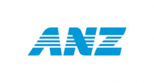 Australia and New Zealand Banking Group’s logo was redesigned in 2009 for $15,000,000. Though the earlier logo was not a brilliant one, it was simple and meaningful. There was nothing strange or anything futile about the old logo. People had accepted the logo and it went well with them for doing business with ANZ. The new logo does not connect with the mindset of people. The new ‘ANZ’ letters lost the dynamic incline of the old logo. The four horizontal lines don’t make any sense. It is not implicit why ANZ needed to spent $15 million to change its good logo to a bad one.
The importance logo cannot be underestimated in the branding strategy. Therefore choosing the right logo is very important for the company. The process takes a lot of time, vision, capacity, strategy and most importantly lot of money. They have become progressively crucial in the corporate world as companies make strenuous efforts to distinguish themselves from one another in the worldwide arena. They have to be simple, readable, visually distinctive, cohesive, relevant and consistent.


